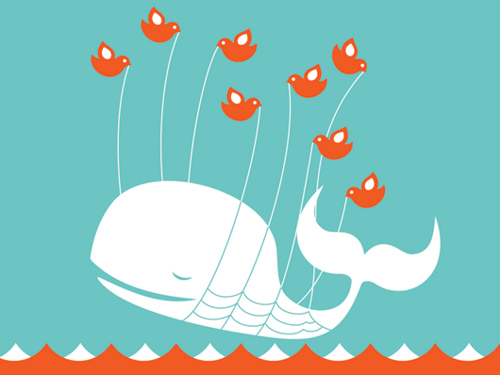
Used with permission, Buzz Bishop
Twitter announced universal availability of their new layout. Immediate user response was about as receptive as public opinion on the new Gap logo. It's bad. It's really bad.
The problem with the new Twitter site is easy to identify. The company that has given so many of us an opportunity to establish and protect our personal or corporate brand is now losing sight of its own. Twitter's strength has always been in its elegant simplicity: 140 characters, maybe a link or a photo, maybe a hashtag. Now, in response to a broad spectrum of user perspectives and an increasing need to generate capital, it risks pandering to the loudest corporate influences and thereby losing the very things that make it distinctive, alienating the large majority of individual users who appreciate the "text messaging on steroids" interface.


Old Twitter vs. New Twitter
(click on either image to enlarge)
In short, the new Twitter is unnecessarily complicated. In the old Twitter, the left column was for reading and writing, and the right column was for everything else, like settings. In the new Twitter:
- The right column changes depending on what I select or click in the left column.
- User information automatically pops up in a small window when I hover or click, which is especially annoying and unhelpful in a mouse less, mobile environment such as an iPad.
- The left column is now for reading, writing, and a random assortment of other things, like saved searches, but notoriously not direct messages.
- The left column now scrolls infinitely, loading more data automatically as you scroll down, which is also a thoroughly annoying behavior when attempting to navigate quickly with a scrollbar.
- I spend most of my time trying to scroll to the right place, moving my eye about the screen chaotically, wondering where I am, instead of reading and clicking on what I want.
- The busy-ness of the new interface causes me to become unnecessarily manic, borderline psychotic. I find myself clicking on things so much to make them appear or disappear that I forget where (or who?) I was before. The old Twitter leveraged a remarkable little device for such things: the browser's "back" button. Has Twitter forgotten that it lives on the Web?
- I can't find the list of common follows when researching a potential new follow. Is it there? Can anyone else find it?
- The background behind the reading pane is irrelevant. This is preposterous for those who applied a significant amount of effort to designing a brand-enhancing background.
The most popular social media sites each offer unique characteristics. Twitter is message-centric. Facebook is a photo, event, and content repository with live, interactive conversation. MySpace is a dark fearful gravitational singularity for tweens and fledgling musical acts. Corporations that have grasped social media by the horns have strategically made a presence for themselves in all three of these, recognizing that each offers them not necessarily a different audience (although perhaps that, too), but a different vehicle for reaching that audience.
The new Twitter blurs those lines to the point of irrelevance. But in so doing, they expose a weakness, not a strength. Twitter does not need to become Facebook or MySpace in order to survive. Quite the contrary, it needs to continue being Twitter.
Question: What do you think of the new Twitter? What should Twitter do next?
 Does anyone remember the marketing disaster of the New Coke? Fortunately, Coke was able to erase that mistake with little permanent damage to their brand.
Malcolm Gladwell's Blink has an excellent chapter on what went wrong with the release of New Coke. Have the Twitter execs and designers read it?
My review of Blink can be found here.